Motion With Meaning: How Frontend Animation Shapes User Behavior
Good animation tells users what just happened and what to do next; bad animation makes them wait, or hides the answer behind a flourish.

Most of us start by treating motion as polish: add a fade, a slide, a little bounce, ship it. But every moving pixel is a message. It says “this changed,” “this is related to that,” or “look here.” When those messages are clear, users move through an interface faster and with less thought. When they are noisy or contradictory, the interface feels sluggish, even if the code is fast.
This post covers how animation steers user behavior, where it backfires, and an honest section on why AI assistants like Claude are good at writing animation code but much weaker at designing the guiding animations that make an interface feel right.
How motion shapes what users do
Animation changes behavior in four main ways.
1. It confirms actions. A button that depresses slightly, a checkbox that draws its tick, a heart that fills: each answers the question “did that register?” Without it, users tap twice, and double submissions follow.
2. It explains where things came from and went. When a card expands into a detail view, or a deleted row collapses and the list closes the gap, the user keeps their mental map. An instant swap forces them to re-orient: where did my item go, and is this a different page?
3. It directs attention. Our eyes are pulled to movement. A subtle pulse on a new notification, or an inline error that slides in next to the offending field, tells people where to look without a modal shouting at them. This is the real meaning of a “guiding” animation: it makes the next step obvious.
4. It manages perceived time. A skeleton screen with a soft shimmer, or a progress bar that moves steadily, makes a two-second wait feel shorter than a frozen blank page. The load time is identical; the experience is not.
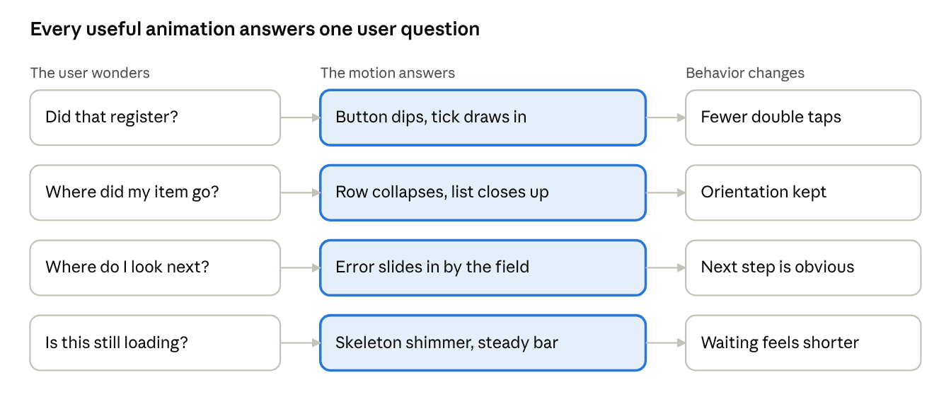
Each row pairs a question the user is silently asking with the motion that answers it and the behavior that follows.
The common thread is that each of these animations is attached to a specific user question. If you cannot say which question an animation answers, it is probably decoration.
When animation works against the user
The same power cuts both ways. Motion that is too slow turns every interaction into a wait: a menu that takes half a second to open is half a second of friction, repeated hundreds of times a day by a power user. As a rough rule, small UI feedback should feel nearly instant, and larger transitions that move content across the screen can take a bit longer. Whatever numbers you pick, test them by using the product, not by watching a single demo loop.
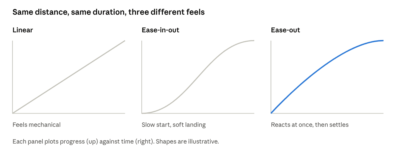
Duration is identical in all three; easing alone changes how responsive the interface feels.
Other common failures:
- Animating everything. When every element bounces in on load, nothing stands out, and the guiding effect is lost.
- Blocking input. If users must wait for an animation to finish before they can click, it is a delay, not a flourish.
- Fighting interruption. Users change their mind mid-transition. If a drawer cannot reverse smoothly when tapped again, it feels broken.
- Ignoring motion sensitivity. Large parallax, zooms, and spinning elements can cause discomfort for some people. The
prefers-reduced-motionmedia query exists so you can swap them for gentle fades or nothing at all, and it should be treated as a requirement, not an extra.
Where Claude struggles with guiding animations
Claude writes animation code well. Ask for a spring transition in Framer Motion, a CSS keyframe shimmer, or a View Transitions setup, and you will usually get something that compiles and runs. The problem is that guiding animation is a design judgment about timing and feel, and that is where it is weakest.
It cannot feel the result. Easing and duration are perceptual. Whether 200 ms is crisp or abrupt depends on how far the element travels, how big it is, and what the user just did. Claude writes the numbers without ever watching them play, so it falls back on familiar defaults: ease-in-out, a few hundred milliseconds, a fade plus a small slide.
It animates by habit, not by question. As the earlier section argued, every animation should answer a user question. Claude tends to add motion because motion is expected: fade in the card, stagger the list, scale the button. The result is an interface where everything moves and nothing guides.
It misses choreography. Good transitions are coordinated: the element that triggered the change moves first, related elements follow, and unrelated ones stay still. Claude usually animates components one at a time, so the pieces do not read as a single event.
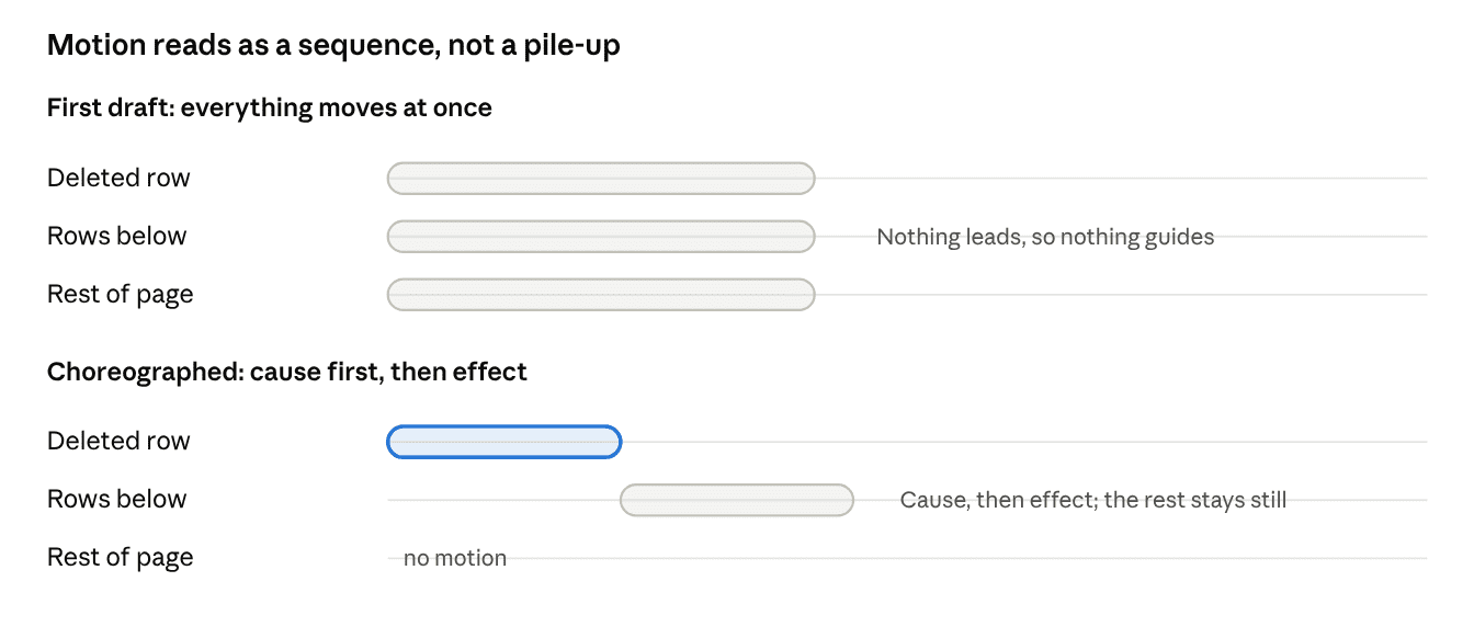
The order is what makes a transition read as one event: the row that was acted on moves first, its neighbors follow, and everything else stays quiet.
It overlooks interruption and state. Rapid taps, a reversed drawer, a route change mid-animation, a list that updates while items are still exiting: these edge cases are where animations break, and they rarely appear in the first draft unless you ask.
It forgets the people who need less motion. Reduced-motion handling, focus management after a transition, and screen reader announcements are often absent unless requested.
None of this is a reason to avoid AI for animation work. It is a reason to be clear about which part of the job it can do, which is the implementation, and which part still needs a human eye, which is deciding what the motion should communicate and whether it does.
A workflow that works
You get better results by supplying the judgment Claude lacks:
- Name the user question first. Instead of “add a nice animation to the modal,” say “after the user clicks Delete, they must see which row was removed and that the list is still intact.”
- Specify the choreography. Describe order and relationships: “the row collapses first, then the rows below slide up; nothing else moves.”
- Set the constraints. State durations, easing, and interruption behavior, and require
prefers-reduced-motionsupport in the same prompt. - Run it and feel it. Play it at full speed, then in slow motion with browser devtools animation controls, then tap it repeatedly. Report back what felt wrong in plain words (“too floaty,” “the list jumps at the end”) and iterate.
- Remove before you add. After the first pass, delete any animation you cannot tie to a user question.
Closing thoughts
Animation is part of an interface’s language. Used well, it reduces mistakes, preserves orientation, and makes waiting bearable. Used carelessly, it slows people down and adds noise. AI tools can take the drudgery out of writing the code, but the question of what a moment of motion should say to the user remains a design decision, and it is worth keeping in human hands.

Giving back after learning from others for so long. A huge Angular fan and most of my posts will be about angular.